

Role: UX & Web Designer, sole intern designer
Tools: WordPress, Sketching, Photoshop, Local
Duration: 5 Months
Team: Myself, Mentor, Business Owner
Background
Eric Deegear, owner of Na’Masaje, developed a distinctive art of body massage built from over 15 years of experience as a massage therapist. His approach blends the most effective techniques he has created or curated, drawing on a wide range of modalities to form a cohesive, personalized method. Each session at Na’Masaje reflects this synthesis: thoughtful assessment, targeted work on tension patterns, and fluid transitions that honor both therapeutic goals and client comfort. The result is a signature style that prioritizes lasting relief, improved mobility, and an elevated sense of well-being.
Na’Masaje Bodywork combines Thai stretching, acupressure, reflexology, and targeted neck and hand work to deliver the full benefits of a traditional massage. Eric trained his own team of bodyworkers to preserve the Na’Masaje vision and techniques. They’ve received over 700 five-star reviews from clients who’ve experienced this modern take on an ancient practice.
Challenge
Customers had trouble finding their way to an appointment, and the site didn’t yet carry the business’s story. Eric wanted a site that was intuitive and easy to navigate.
Project goals
Eric and my mentor set five goals for the redesign:
Make it easy to book appointments for singles and couples
Explain the importance of caring for mind, body and soul through blogs
Share the experience of bodyworkers and clients through testimonials and videos
Build a support experience that ties the Contact Us chatbot to the front-desk concierge
Attract new clients through SEO and blogs
My Role
I was the only intern on this project and took ownership of the design from research through the WordPress build. My mentor and I met with the owner directly, and I led the design work and decisions from there.
Research
The research involved six volunteers recruited from my personal network. While their experiences provided useful qualitative feedback, the sample was limited and was not intended to represent the entire Na'Masaje customer base.
The interviews provided an opportunity to evaluate the website experience, but further testing with existing customers and a broader audience could have provided additional insights.
Understanding the Business & Its Users
Na'Masaje wanted to create a more intuitive digital experience that connected clients with its bodywork services, practitioners, and three studio locations across Idaho.
The existing website needed a more organized navigation structure and improved access to essential information, particularly appointment scheduling. The business also wanted to strengthen its online presence, attract new clients, and create opportunities for future growth through educational content, testimonials, and e-commerce.
To better understand the experience from a potential client's perspective, I conducted two rounds of user interviews with six female volunteers who had varying experiences with physical pain and discomfort.
Research Objectives
My research focused on understanding:
How easily could visitors navigate the website?
Could potential clients locate relevant services?
Was appointment scheduling easy to find and use?
Could visitors identify practitioners and studio locations?
Did the redesigned experience make important information easier to access?
User Research & Interviews
I conducted two rounds of interviews to explore how potential clients interacted with the original website and evaluate the redesigned experience. I documented their feedback and observations through written notes.
Key Research Finding
Round 1: Original Website Evaluation
I recruited six female volunteers with different experiences of physical pain, including general discomfort, muscle soreness, and other pain-related concerns.
During individual interviews, participants were asked to:
Explore the existing website and share their initial impressions.
Locate relevant services and information.
Attempt to navigate the appointment booking experience.
Round 2: Redesigned Website Evaluation
After developing the redesigned website, I conducted a second round of interviews with the same group of participants.
Participants explored the updated experience and repeated similar activities, including navigating the website, locating services, and attempting to book appointments.
This allowed me to gather feedback on the redesigned experience and compare their impressions of the two website versions.
What I found
Booking was findable, but slowly. All 6 found the booking system, but it took each of them time.
Booking links were too sparse. Several wanted a way to book right away from any page, without hunting for it.
Staff were hard to tell apart. Participants couldn’t tell who each practitioner was or what they specialized in, which made it hard to choose someone.
The feedback was consistent. Across the sessions, people described the same friction in almost the same words.
Concept
After reviewing the project requirements and identifying the website's primary needs, I began developing a new website structure and navigation experience.
My goal was to create a more intuitive experience that allowed visitors to move naturally from discovering Na'Masaje's services to finding a practitioner and scheduling an appointment.
Information Architecture & Navigation
I restructured the website's navigation and organized its content into dedicated pages to make information easier to discover.
The redesigned structure included:
Home
Services
Locations / Contact
Meet the Team
Blog
Events
Store
Trainee Application
I also developed a new navigation user flow to establish clearer pathways between the website's pages and important actions.
Appointment Booking Experience
Appointment scheduling was one of the primary priorities of the redesign.
Rather than limiting booking access to a single page, I incorporated booking links throughout the website so visitors could schedule appointments as they explored.
I also designed specific booking pathways:
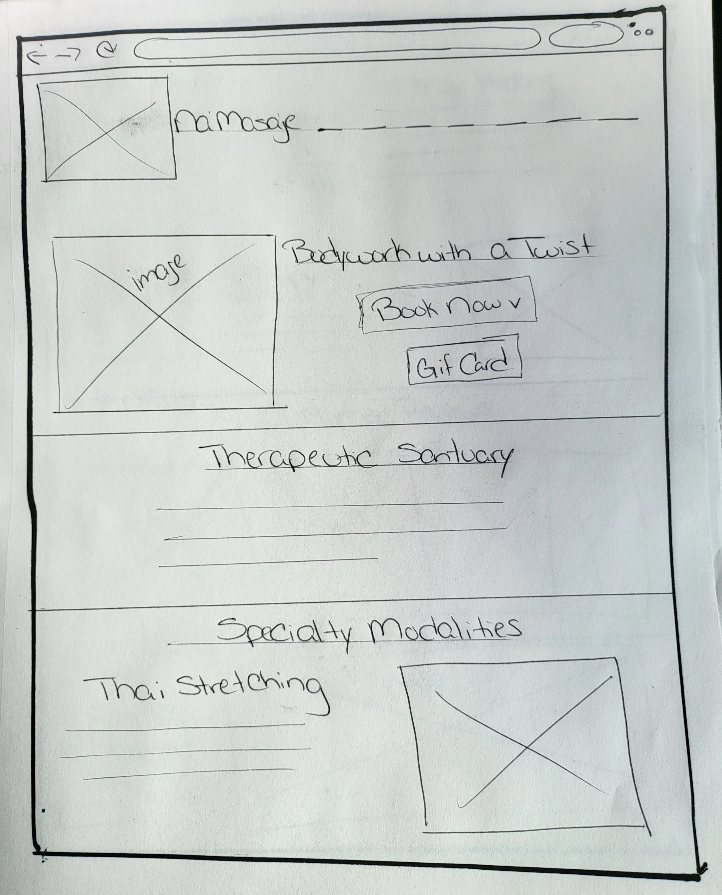
Services: Booking options alongside featured services.
Meet the Team: Direct booking links associated with individual practitioners.
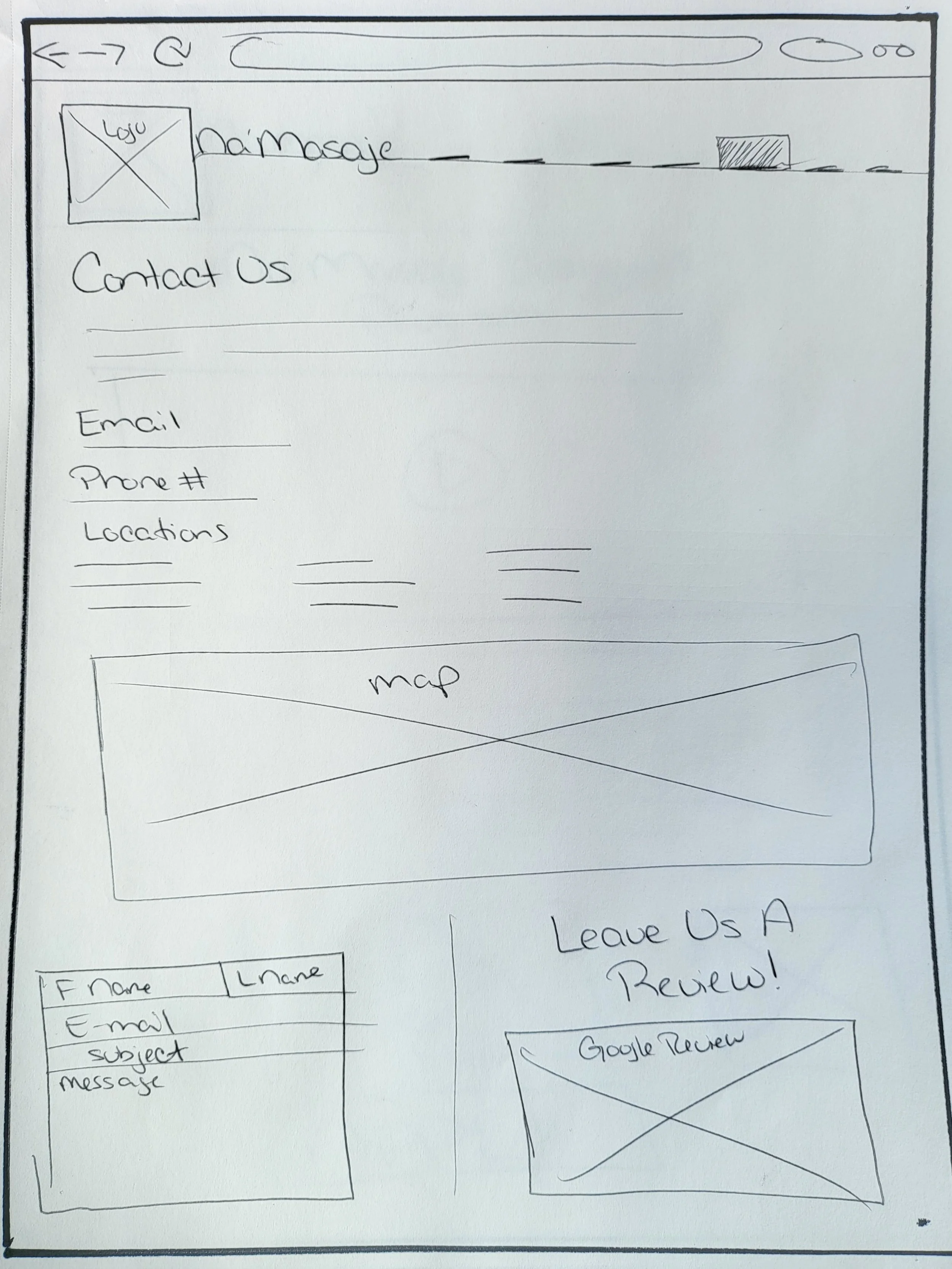
Locations: Location-specific booking options for Boise, Caldwell, and Mountain Home.
This approach was intended to reduce unnecessary navigation and make scheduling more convenient.
Wireframes & Page Structure
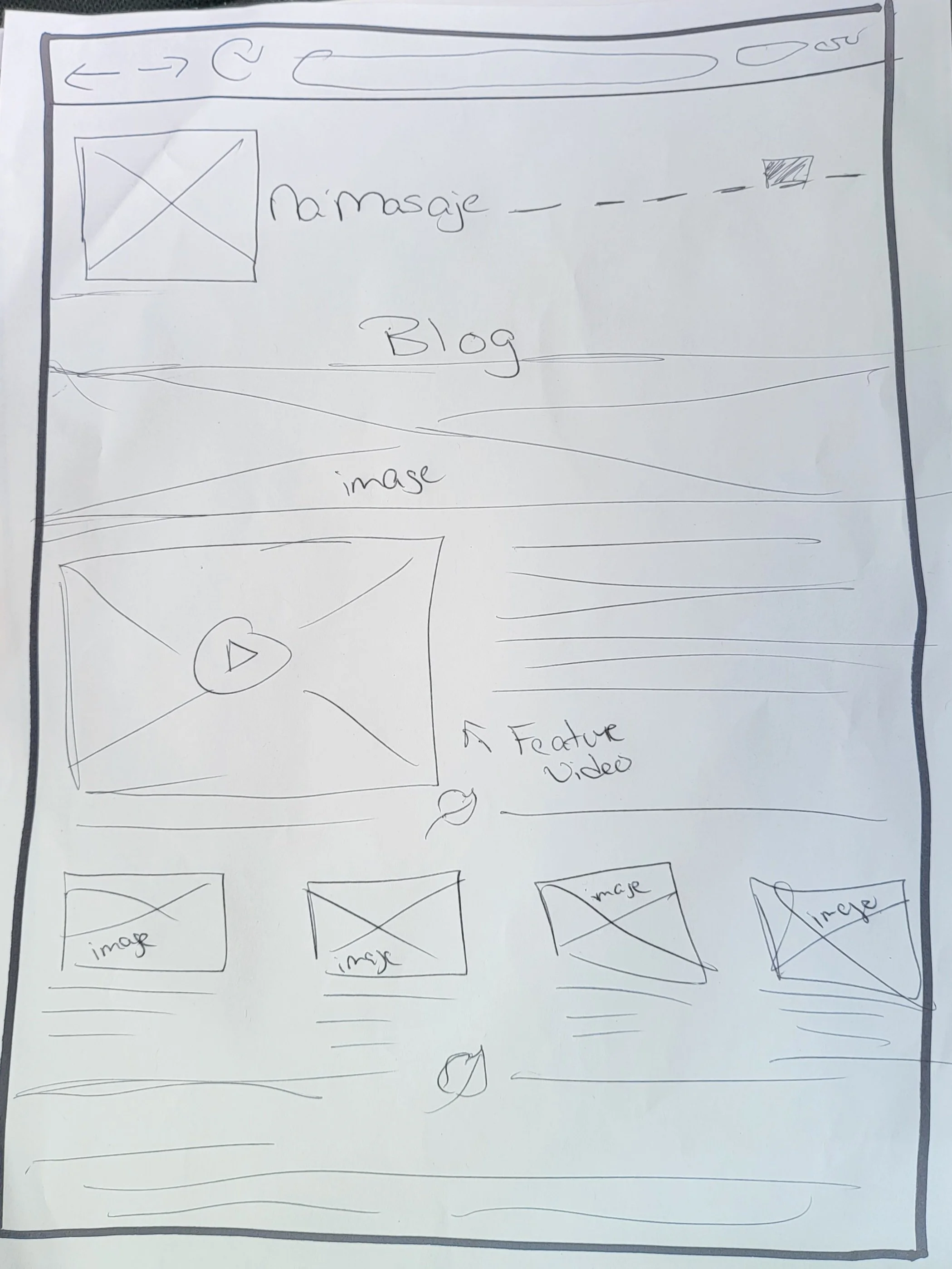
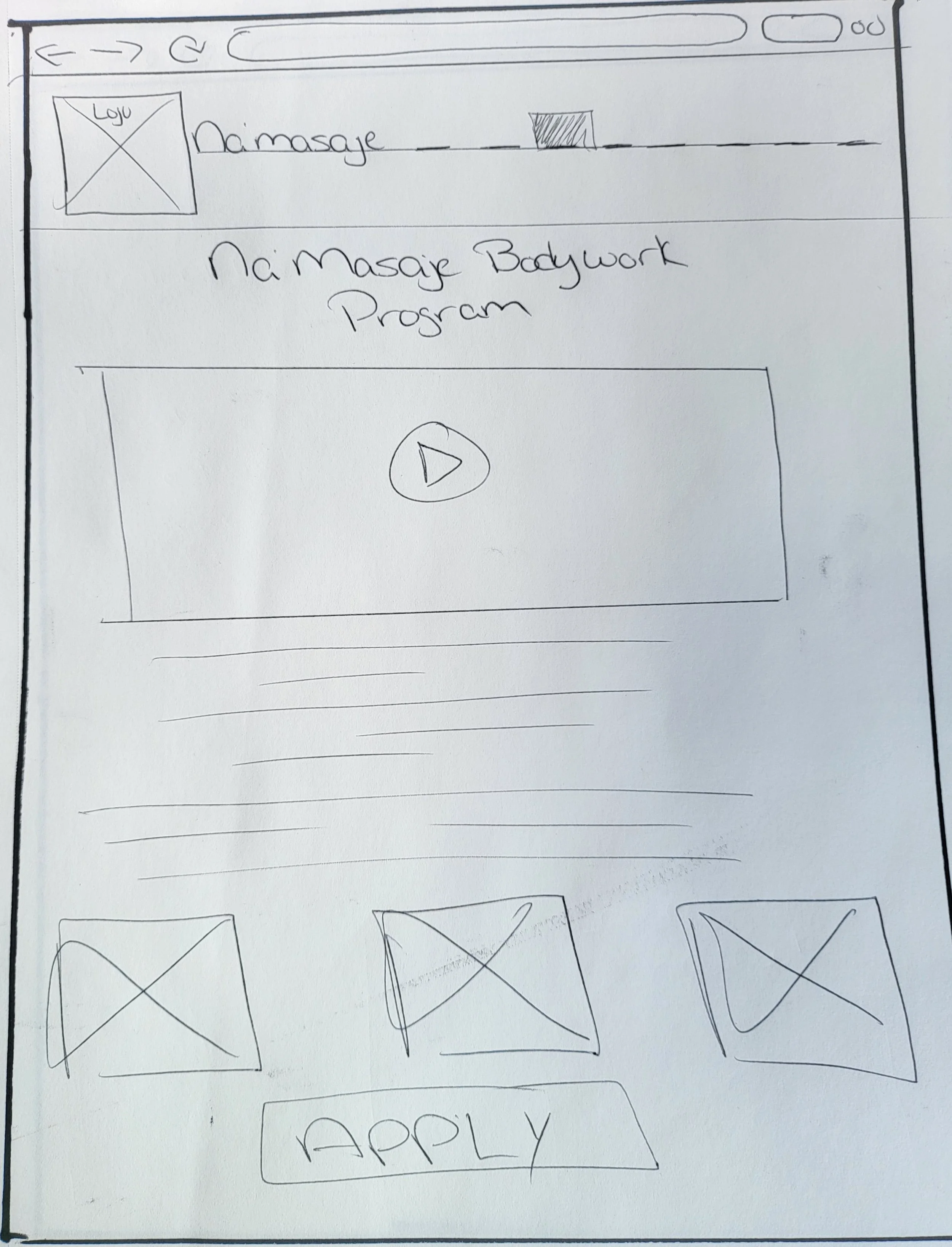
Before building the website, I created wireframes to establish the page layouts, content hierarchy, and placement of important elements.
These wireframes helped translate the original product requirements into a more organized website experience.
I also planned reusable blog templates to establish a consistent content structure for future articles, even though the business was not yet ready to publish blog content.

Designing for Future Growth
In addition to the immediate website needs, I incorporated pages and structures that would support future business initiatives.
These included:
A trainee application page to help attract prospective bodyworkers.
Blog templates for future educational and SEO content.
An events page to communicate upcoming and past events.
A store structure intended to support future product sales.
The overall concept focused on creating a website that could serve both the immediate needs of clients and the longer-term goals of the business.
Based on two other websites for inspiration that were also massage industry businesses, I compared what Eric liked and didn’t like about each webpage and used those insights to create rough sketches aimed at finding a balanced user flow. Each sketch is a quick draft covering the four main, top-priority pages of the website that I was tasked to focus on most, intended to illustrate layout, content hierarchy, and basic navigation paths.
Conclusion
Redesigning the Na'Masaje website was an opportunity to turn business requirements and user needs into a more organized and accessible digital experience. From restructuring the navigation and creating new pages to implementing appointment booking pathways, I worked to make it easier for visitors to explore services, connect with practitioners, and find the right studio location.
As the project progressed, my mentor, the business owner, and I mutually agreed that the immediate priority was to launch the redesigned website as soon as possible. Rather than delay the launch to complete every feature in the original scope, we decided to create templates and establish a foundation for additional features to be incorporated in future updates.
The website launched in September 2023. Following the launch, additional updates were made, including adjustments to imagery, updated staff and mentee information, and additional website content. Approximately six months after launch, my mentor shared that website traffic had increased by 20% and that the redesign had made significant improvements. Although I was not given access to the detailed analytics, it was encouraging to hear this feedback about the website's progress.
Despite learning WordPress and Elementor along the way, I was able to bring the redesign to life while incorporating the visual direction of the provided inspiration websites and preserving key elements requested by the business.
I'm proud of the work I contributed to the project, particularly the opportunity to take a website from initial research and wireframes to a live experience. This project taught me the importance of balancing user needs, business priorities, technical constraints, and launch timelines while creating a foundation that can continue to evolve.

One of my biggest challenges throughout this project was learning WordPress for the first time while simultaneously bringing the website redesign to life. Although I had experience with UX design and wireframing, translating those designs into a functional website introduced a new set of technical challenges.
I encountered several setbacks while attempting to implement features outlined in the original project scope. Limited access to certain WordPress extensions and plugins, combined with my unfamiliarity with the platform, meant that some features, including the chatbot and e-commerce functionality, had to be moved to future development. Despite these challenges, I remained committed to delivering an improved website experience within the resources available to me. I gained hands-on experience with WordPress and Elementor, developed a better understanding of website implementation, and learned how technical constraints can influence design decisions.
Looking back, I would approach this project with a stronger technical discovery phase, exploring available plugins, integrations, and platform limitations earlier in the process. This would have helped me better prioritize features, establish realistic implementation timelines, and identify potential roadblocks before development began. Ultimately, I enjoyed the experience and am proud of what I accomplished. This internship taught me that good design isn't just about creating an ideal experience; it's also about understanding constraints, adapting to challenges, and finding practical ways to bring ideas to life.