
Role: Lead UX Researcher & Stakeholder Communicator
Tools: Miro | FigJam | Figma
Duration: 5 weeks
Team: Team of 5 (5PX)
NDA Notice: This project is covered by an NDA. Some features are not shown in this case study.
Background
In 2020, Humanity Health was launched, dedicated to revolutionizing the process of career acceleration and talent sourcing specifically for underrepresented leaders within the healthcare and life sciences sectors. Utilizing cutting-edge technology alongside a bespoke service model, Humanity Health actively facilitates career advancement opportunities and strategic introductions for women and individuals from diverse ethnic backgrounds.
“People of color represent less than 15% of executives in the largest U.S. based healthcare companies (Even though they represent 40% of the population). Data shows that diverse management teams are more innovative than less diverse teams, translating better financial performance.”
Challenge
Humanity Health's onboarding design has become antiquated and cumbersome, creating friction for both new and existing members. This outdated system not only frustrates users but also discourages potential new sign-ups from downloading the app and pursuing further engagement.
Research
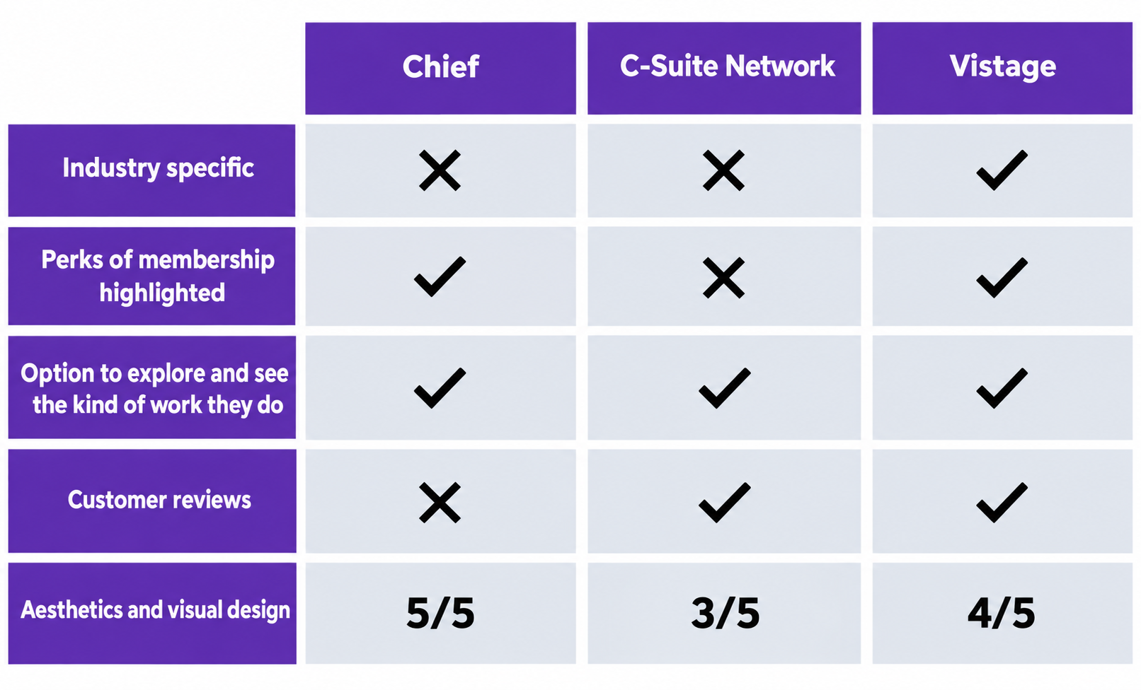
The first research challenge was a lack of access to C-Suite candidates. We adjusted our approach to concentrate on leadership positions at the supervisor and manager levels, compared three similar networks targeting C-suite and senior executives, and assessed the potential advantages of joining those networks.
Interviews & Surveys
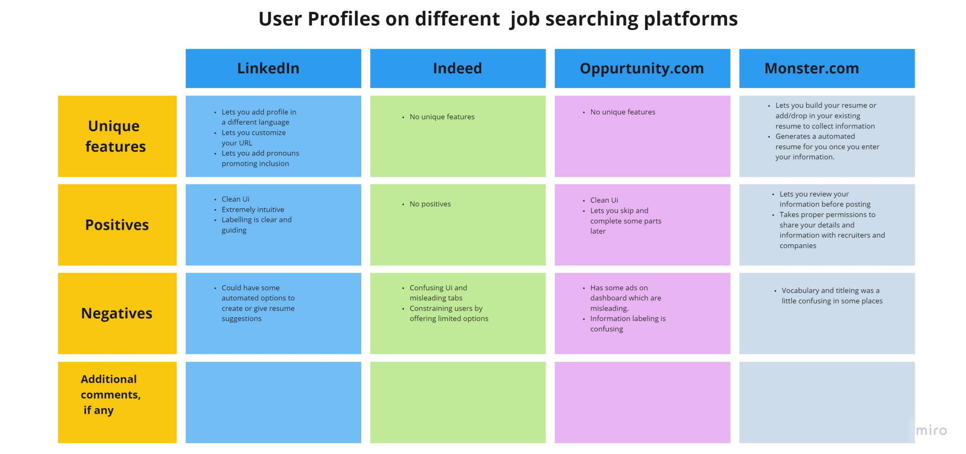
With limited access to comparable solutions that concentrate on C-suite level networking applications and onboarding, I analyzed popular job search platforms to identify the most effective features from each. Then evaluated which of those elements would best enhance Humanity Health’s onboarding and sign-up experience.
First round of interviews, I interviewed two participants who were knowledgeable about the healthcare industry or related fields, using a screenshot of Humanity Health’s provided materials. I designed two different interview experiences. For the first participant—someone I did not know I pretended to prompt and invite them to the onboarding process, observing and analyzing their behavior and reactions to the screenshot.
The second interviewee was an acquaintance of mine. I reached out to them as a familiar contact in the field, inviting them to participate in the onboarding process. Each experience began the same way: they were confused at first and expressed doubt about what they were seeing based on the screenshot they had been given. Whether they knew me well or only casually, they still felt uncomfortable and uncertain of the material in front of them. Realizing that regardless of who you may know trust was going to be the biggest outcome in encouraging candidates to join the organization.
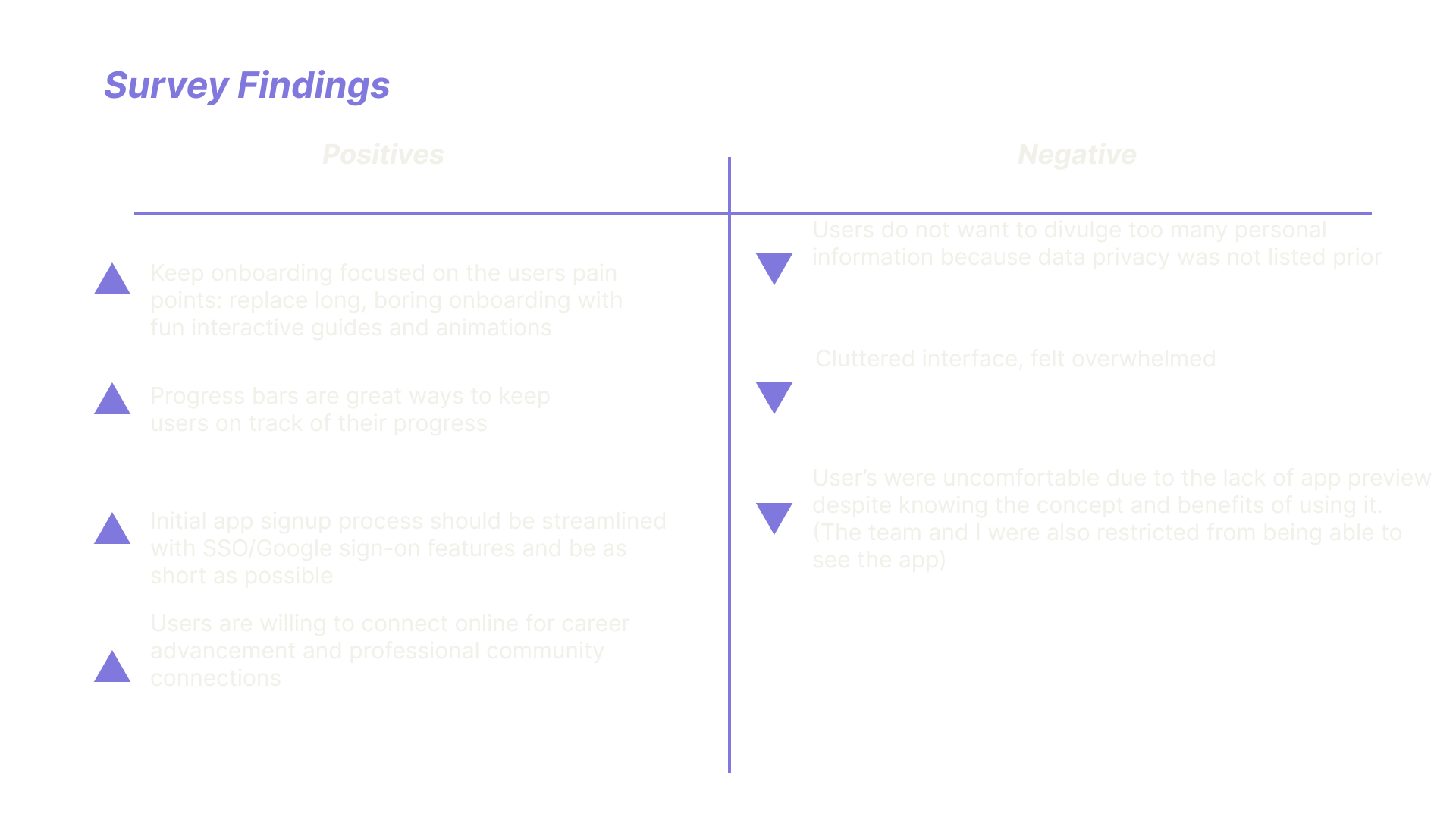
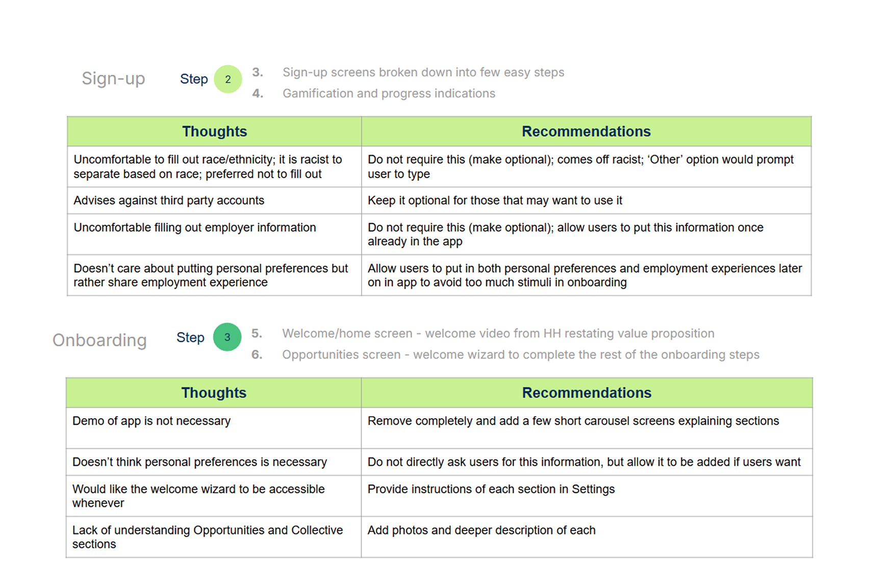
After the first round of interviews, we created a survey and invited 14 candidates at the supervisor level or higher to participate using the same screenshot. We adjusted the prompt to focus on building trust with candidates to facilitate their progression to onboarding access. Image above are the results we found.
Concept


Individually brainstormed user flow and information architecture concept to address key concern and feedback gathered from our survey, aiming to determine the most effective experience. Collaborating everyone’s ideation into one final user flow.
Low & High-Fidelity Testing
After the final user flow, each team member sketched rough onboarding wireframes. After much debate using the survey and first interviews, I contacted the Director of Humanity Health Design. We compared our concepts with the survey and interview results and reviewed test results from the low‑fidelity interviews, which included the two original interviewees plus three more recruited from the survey.
The newest challenge was getting accurate sign-up responses. My team and I didn’t know medical terms, or which field each option meant, so interviewees couldn’t reliably choose their specialty. We used past interviews and extra research to pick a few familiar high-level titles (e.g., Cardiovascular, Radiology). Interviewees also asked how long sign-up would take, so we added a progress percentage bar throughout the designs before presenting the wireframe to the Director.
Director feedback shifted the sign-up mood. The company wanted a light, welcoming experience, so signing up felt fun and approachable rather than like a chore. I wrote a few simple, respectful questions designed to build trust and help users quickly connect with peers and opportunities in the healthcare industry.
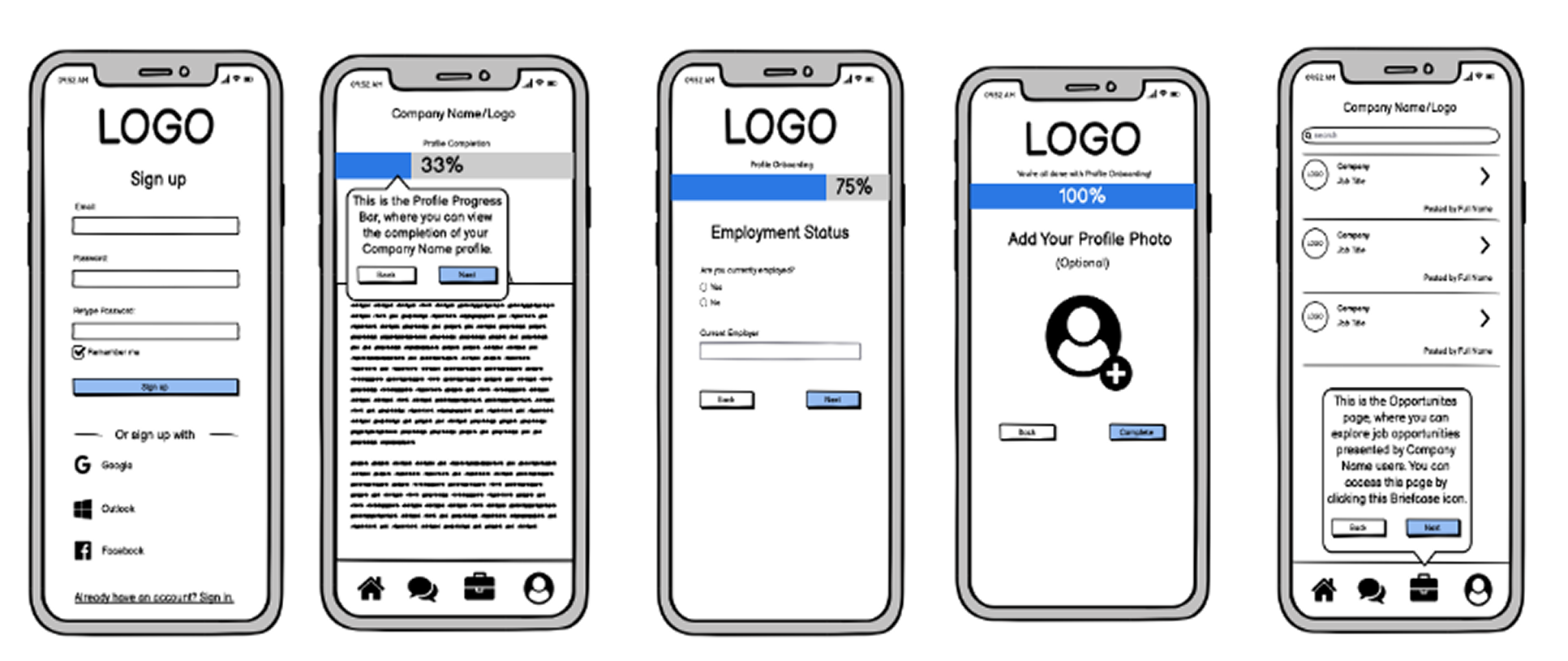
Low-fidelity prototype
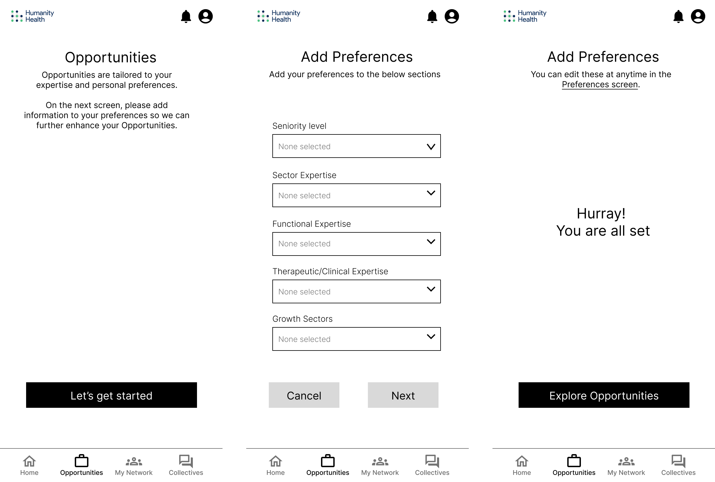
High-fidelity prototype
In the final design stage we made two high-fidelity prototypes. We split the original volunteers into two separate controlled groups. Each group saw different fun-fact questions and different sign-up experiences.
Group A
Drop down menu style
Signup order:
Introduction Video
Login / Signup Page
Personal Info
Medical Field Info
Fun Facts
Opportunities Suggestions Page
Onboarding Dashboard
Group B
Accordion menu style
Signup order:
Login / Signup Page
Three Introduction Pages
Personal Info
Medical Background
Opportunity Suggestion Page
Fun Facts
Onboarding Information Video
Onboarding Dashboard
Conclusion
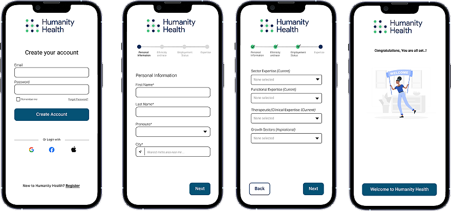
For the final design, the key changes included reducing the number of onboarding screens, redesigning the progress bar, and adding an optional "fun facts" page at the end to make the experience feel engaging and light rather than demanding. Most importantly, we focused on building trust early in the process, giving high-level, C-suite medical professionals a secure space to network and unlock new opportunities all within a single app.
Thoughts
If I could redo the user interviews, I would invest more time in the introduction and setting expectations. I noticed a distinct shift in candor: participants I already knew were open and relaxed, while unfamiliar volunteers were hesitant about both me and the unfamiliar product. In future projects, I plan to incorporate digital icebreakers to build trust, reducing user apprehension early in the journey.
Additionally, this project taught me the critical UX discipline of balancing user and client needs against my own aesthetic desires. While I had many highly polished visual ideas, I maintained a strict focus on the project scope and target demographic. By prioritizing functionality over personal preference, my team and I created a seamless user flow tailored to professionals looking to expand their high-level networks.